.png)
How to Read Forex Trading Charts? A Beginner’s Guide
Jul 07, 2025 12:00 amHave you ever opened a Forex chart and thought, “What on earth am I looking at?”
You’re not alone.
When you're just starting on Forex trading platforms, the charts can look confusing. Lines going up and down, strange patterns, and weird colours. It can feel overwhelming at first.
But don’t worry. Learning to read a Forex chart is like learning to read a map. At first, it’s tricky. However, after you understand the basics, everything becomes clear.
What is a Forex Trading Chart?
Think of forex charts as the heartbeat monitor of currency pairs. They show you how the relationship between two currencies has changed over time.
Whether it's the past hour, day, or even year, when you see a EUR/USD chart, you're looking at how many US dollars it takes to buy one Euro, and how that relationship has evolved. It helps traders identify the trend, whether prices are rising, falling, or remaining stable.
Why Charts Matter in Forex Trading
Charts are essential in forex trading. They organise all the market activity, like trades, trends, and patterns, into a format that’s easy to read and understand. Charts are the foundation of forex technical analysis, which involves using past market information to predict future market trends. With charts, traders can:
With Charts, traders can
- Quickly spot trends: See if prices are generally moving up, down, or sideways.
- Identify crucial price points Identify the price areas where the price tends to stop and change direction.
- Recognise patterns: Notice shapes and setups that can hint at what might happen next.
- Manage risk: Use past price movements to set smart stop-loss and take-profit points.
- Track market activity: Some charts show how many people are trading, so you know when big moves might happen.
Overall, charts are a vital tool that helps both beginners and experienced traders make informed decisions in the fast-paced world of forex.
There are usually three types of Charts.
Let’s have the forex chart analysis by understanding these charts
- Line Charts
- Bar Charts
- Candlestick Charts
Line Chart
A line chart is the simplest visual tool used in Forex trading to illustrate how prices have changed over time. This makes it straightforward to see the general trend of the market.
Line charts are great for beginners because they are easy to read and focus only on the closing prices, which many traders believe are the most important.
- Shows only the closing price for each period, ignoring highs and lows.
- Helps you spot general trends (up, down, or sideways) quickly.
- Reduces “noise” from small price changes within each period.
- Best for gaining a comprehensive understanding of the market.
Source: barchart.com
Bar Chart
Compared to a line chart, a bar chart offers a more detailed view of price activity. Each bar represents a specific period, showing the opening, closing, highest, and lowest prices for that period. Bar charts help traders understand not just the direction of the market, but also how much prices moved during each period.
- Each bar has a top (representing the highest price), a bottom (representing the lowest price), and trim lines on the sides for the open and close prices.
- Let’s see how much prices moved in each period.
- Helpful in spotting price ranges, volatility, and reversals.
- Helps you identify when buyers or sellers are in a stronger position.
Source: barchart.com
Candlestick Chart
Candlestick charts are the favoured visual tool for forex trading, with each candlestick representing the open, high, low, and close prices within a specific timeframe. The body of the candle is coloured to show if the price went up or down, making patterns and trends easier to spot.
- Green or white candlesticks typically indicate a price increase, while red or black ones show a price decrease.
- The fat part of the candle shows you the starting and finishing prices.
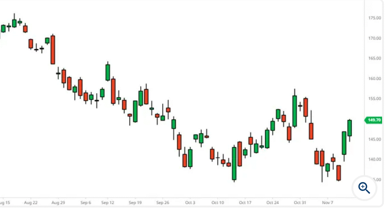
Source barchart.com
How to Read a Forex Chart (Step by Step)
We have now understood the types of charts; it is now time to understand these charts and the specific jargon associated with them.
Here’s a simple way to get started:
Step 1: Find the Trend
Look at the chart and ask:
- Are prices going up? That’s an uptrend
- Are they going down? That’s a downtrend
- Are they moving sideways? That’s a range
You can also use tools like trendlines or moving averages to see the trend more clearly.
Step 2: Spot Support and Resistance Levels
- Support indicates a price level where a downward trend usually stops and prices are likely to increase once more.
- Resistance is where prices often stop rising and come back down.
Step 3: Look for Patterns
Over time, prices form shapes or patterns on the chart. These patterns repeat because traders react in similar ways.
These shapes are tools used in Forex technical analysis to make better trading choices.
Step 4: Use Indicators (But Keep It Simple)
You can also add indicators to your chart to get extra information.
Good ones to start with:
- A moving average indicates the typical price level of an asset over a specified period.
- RSI (Relative Strength Index) tells if a currency is overbought or oversold
- MACD shows momentum and trend direction
Ready to Try It Out?
At NXG Markets, we’re here to help you navigate the world of Forex trading with confidence. Our intuitive platform, powerful trading tools, and step-by-step educational resources are designed to support you at every stage of your journey.